TL;DR Science: Figures
By Carlos Mercado-Lara
April 22, 2020 · 4 minute read

Figures are a key part of any research because of their ability to allow readers to better visualize the data that you have collected. The majority of judges, professors, and peers reading your paper will spend a significant amount of time looking at your figures to make their own conclusion and gain an understanding of how you analyzed your data. After reading this blog, you should be able to effectively describe and demonstrate the data that you accumulated through your research method.
What is a Figure?
As best explained by the writing center at the University of North Carolina Chapel Hill “Figures are visual presentations of results. They come in the form of graphs, charts, drawings, photos, or maps.” The majority of data that you deal with in research, whether you are collecting it yourself from experimentation or you are using open-source available, will come in a tabular format similar to the data shown below. If you are measuring the growth of a plant, animal, or simply taking time stamps of an experiment, it is typically simplest to insert that data into excel or in a lab notebook. When it is time to present that data, having it organized can make it easier in generating figures. To demonstrate these key points, we will construct a figure to represent the accumulated annual average rainfall in Florida over between 2008 and 2019. As shown below, this is a sample of raw data that was collected by the southeast regional climate center of the United States.
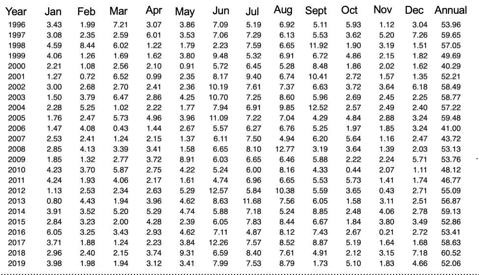
At a glance, there is a lot of unnecessary data that will not need to be examined through plotting. Here we see the average rainfall for every month, and the yearly average accumulation on the last column. Notice how the months and different years are presented. Our objective is to illustrate the yearly change in rainfall in a visual manner. Hence, we will not be needing the average rainfall every month or anything prior to 2008. When you go about creating your own figures, it is important to decide what data you feel is valuable to include and what data to exclude based on how strongly it supports the hypothesis of your research.
What type of figure to use?
Choosing how to represent this data visually is key. You might have access to very robust data, but if you present it in an ineffective manner, you can potentially end up hurting your own argument and only confuse your audience. If you are unsure how to present this data, below are some tips for the best practices and best figures to use for your own data.
- If it is numerical data, graphs can be useful as they can simplify complex information and highlight patterns and trends. What is the minimum amount of axis used from elementary to high school? Two. The x-axis and y-axis. Therefore, you must have two variables/relationships that you are trying to compare. Additionally, you must have three variables that you would like to compare if you were to use three axis
- Pie charts are best used to show the distribution of certain items that constitute a whole. The best way I like to think of this is a voting situation. All percentages add up to 100 (Including non-voters as they make up a percentage of the whole). Just remember that all percentages in a pie chart must add up to 100%.
- Bar graphs are used best to show the relative frequency of discrete categories. A simple way of thinking about is if you were to count the different colored shirts that you own, you would first categorize by color (Discrete Categorization) and then count how many you have within each color group
For this figure, we decided to utilize a scatter plot to better visualize the trends in rainfall rear after year. Using Excel, we generated a plot based on the years and average accumulated rainfall for that year. Since there are two relationships, year and average rainfall per year, I wanted to allow my paper's readers to make their own deductions about the trend but also convey my message: Average rainfall in Florida peaked in 2018, with a total average accumulated rainfall falling at 60.52 inches.
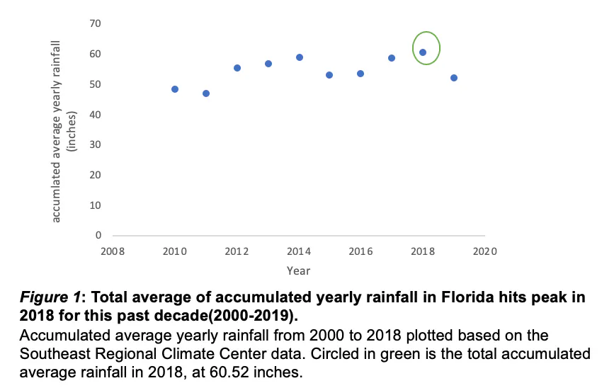
As you can see here, the figure is labeled in every axis, and the title is included at the bottom with a short caption. In APA format (link to specific guidelines can be found below), this is the correct means of representing a figure title and caption. However, your rubric or guidelines may vary; If you have any concerns about correctly presenting data, it is best to first consult your teacher or professor. Additionally, you can ask for help here on SciTeens and receive expert advice from mentors.
It is crucial for your figure's title to be clear, concise, and relevant. The title of the figure above meets all three of these criteria, and also provides an indicator (in this case a circle) to further direct the audience to the intended message of the research. The caption describes what is observed. Note, the title reflects the message, while the caption simply describes what information is within the figure. Additionally, all axis are clearly labeled and units are provided.
It is important to note that there are other analyses that can be made from this figure. For this demonstration, I decided to make it a simple deduction. In future blogs, I will be talking more about these analysis techniques that can be used.
TL;DR
When you go about adding graphics to your research paper, it is important to remember that not every table is a figure. If the graphic that you are poviding to your paper is a figure, it is important to provide clearly defined labels and legends so that your reader may better understand your work. Additionally, the title of your figure should describe the key point that your figure is attempting to convey to the reader.
Sources:
https://writingcenter.unc.edu/tips-and-tools/figures-and-charts/
https://www2.le.ac.uk/offices/ld/all-resources/numerical-data/numerical-data
Did you enjoy this article?